Dog Gone Seattle is the largest foster-based dog rescue in the Pacific Northwest area. With a mission to rescue, respect, and repeat the process of foster and adoption-based dog care, I served as the lead designer on this project through my work at an agency to better display information, improve visual appeal, increase conversions for individuals looking to support the rescue.
Dog Gone Seattle
Why a redesign?
The Dog Gone Seattle website is home to thousands of visitors every month looking to foster or adopt a dog through the rescue. However, the client has noted that options to support the rescue are difficult for visitors to find. Additionally, the client wanted a website that better reflected specific CTAs from the rescue while also showcasing the growth of their organization’s services.
DESIGN QUESTION
How might we make it easier for viewers to find information about fostering, adopting, and supporting the rescue?
Homepage - Before
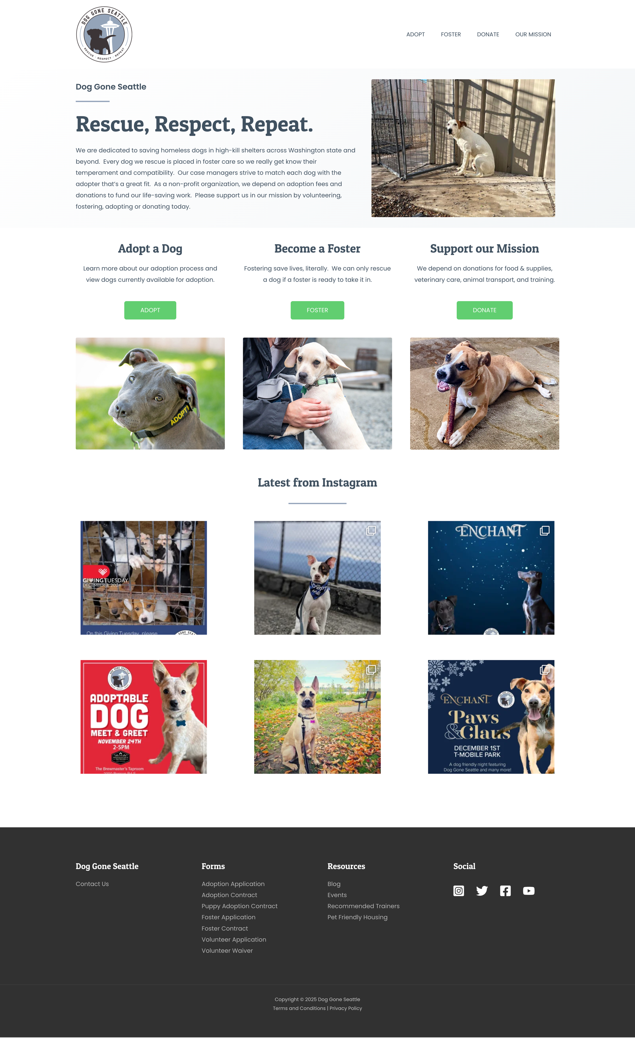
Adoptable dogs are difficult to find from the homepage. Only one CTA button takes the user to information regarding adoption, despite this being the rescue’s largest need.
Lack of imagery and copy focused on the rescue’s mission.
Images only showcase dogs, and not volunteers or foster parents – the people involved with supporting the rescue.
Meanwhile, the homepage copy is minimal. Users users must navigate to secondary pages to learn more.
Information regarding volunteering is only located in the footer.
Bulk of homepage is occupied by an Instagram profile grid.
Individual Dog Page - Before
Only one button to take users to adopt the dog is located on the page.
Center alignment of the dog name/metadata and image gallery pushes key information down on the page
Image gallery lacks navigation. Users must click on individual photos to progress photos.
No text styling to indicate clear animal profile, foster update, and adoption information sections.
Adoptable Dogs Page - Before
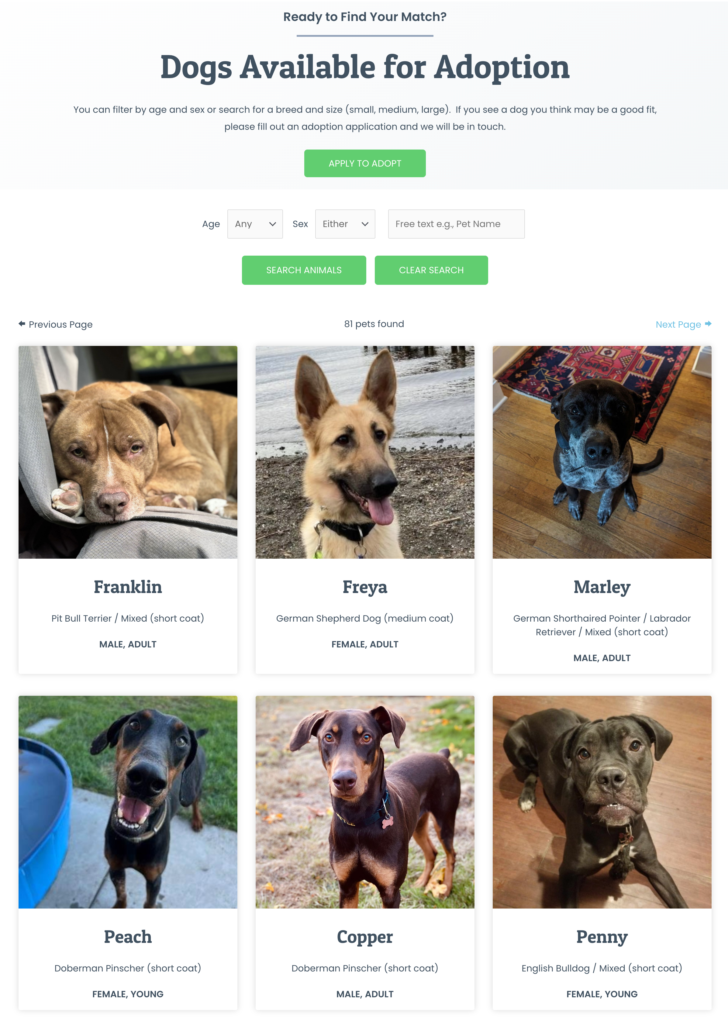
Individual dogs can only be filtered by age and sex due to toolkit limitations. However, users are often looking for dog sizes as a criteria for adoption.
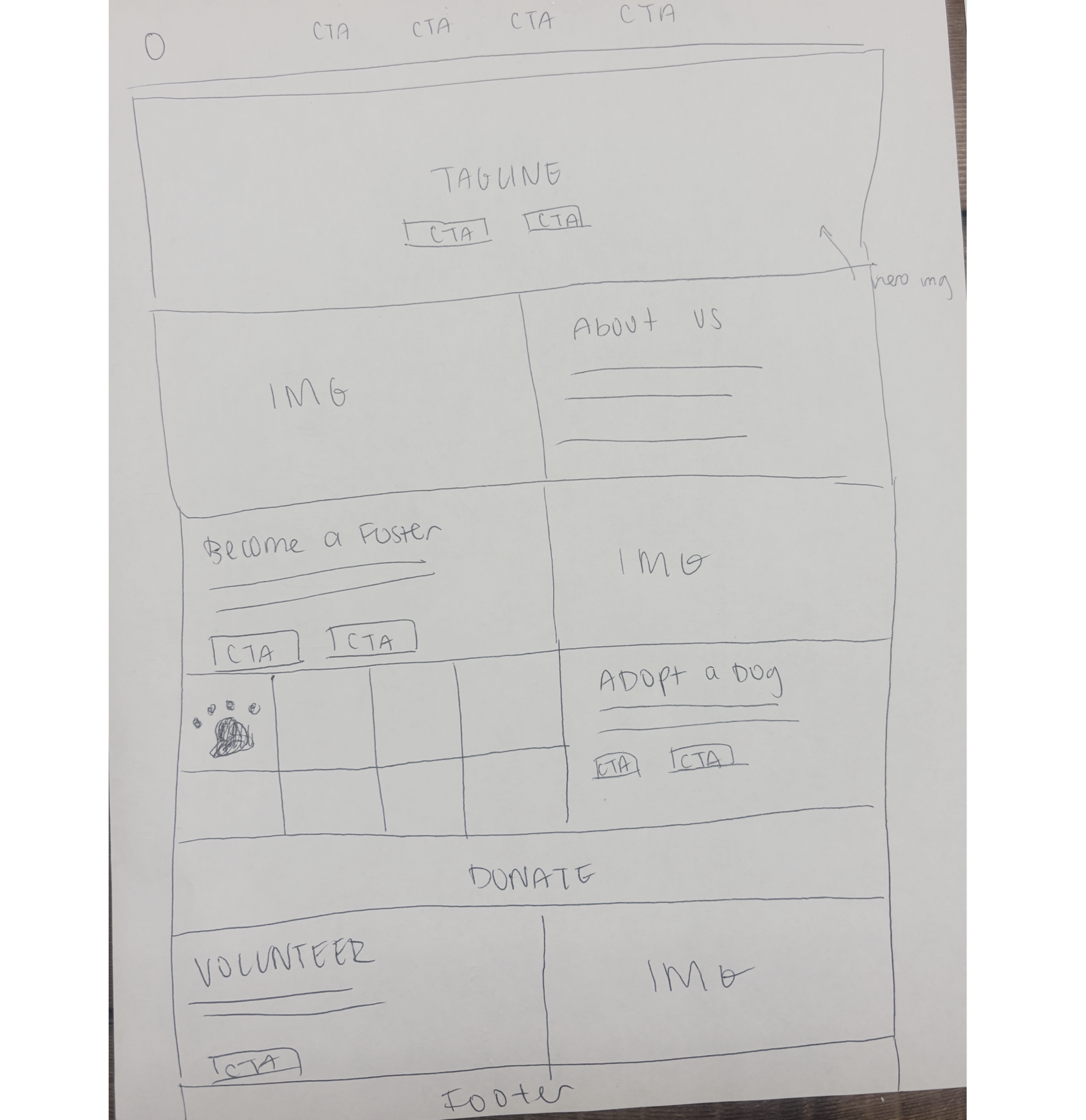
Initial Sketch
Before diving into the website design, I made a rough sketch of the site’s homepage. My primary goal with the sketch was to highlight the rescue’s four main CTAs – Adopting, Fostering, Donating, and Voluntering.
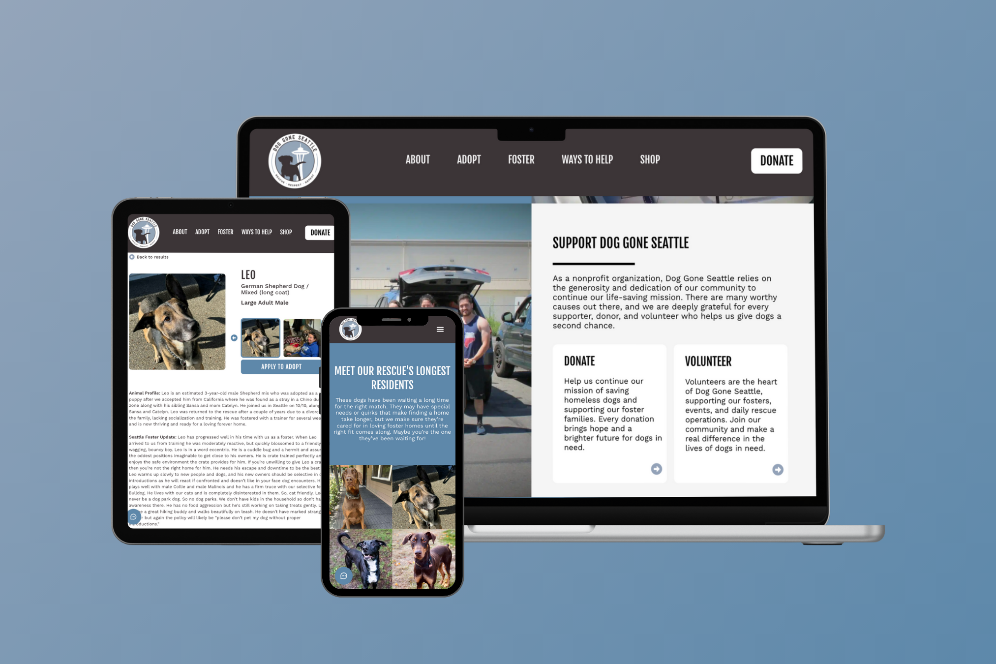
Homepage - After

Menu has expanded to include all core CTAs, with a button to indicate emphasis on donation
Hero section contains buttons to the two key CTAs – adoption and fostering. Users can immediately navigate to these pages as soon as they enter the site.
To better reflect the core of the DGS mission, images show real fosters and volunteers alongside their dogs.
Fostering gets its own spotlight. Users can learn more about the fostering process and navigate to an application form or additional information right from the homepage.
Added a homepage section to reflect two secondary ways to support the rescue – donations and volunteering – and provide visitors a way to easily find ways to provide their support with additional information.
Dogs most in need of adoption also get their own section on the homepage. Users can clearly see the dogs that have been at the rescue the longest, and can click on each individual dog to be taken to their own profile page.
Featuring the DGS podcast on the homepage informs users that there’s a way to hear a “behind-the-scenes” look into running the rescue.
A redesigned footer splits the site navigation into 5 core sections to help users quickly find the information they need.
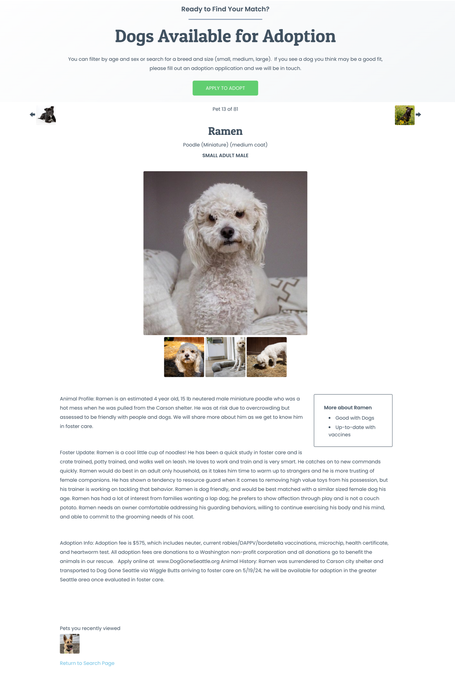
Individual Dog Page - After
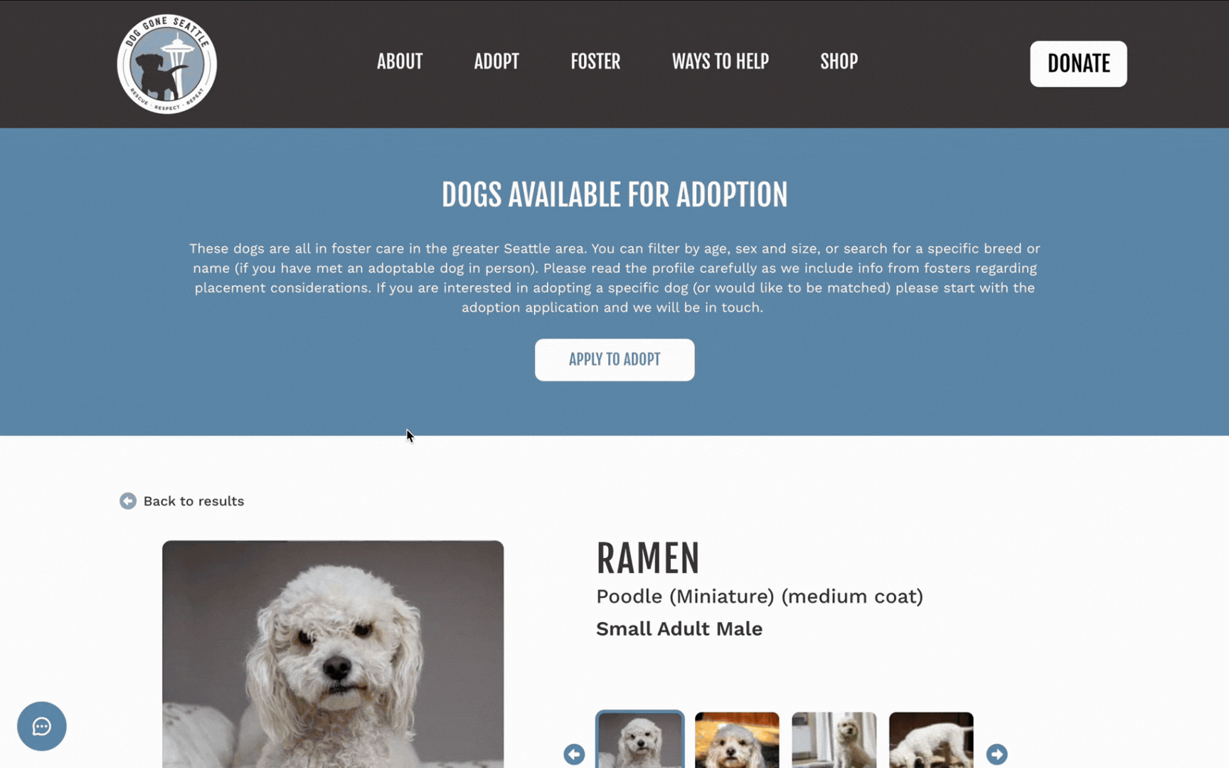
Dog name, metadata, and gallery were reformatted to prevent key information (i.e. adoption info) from being pushed further down on the page
Arrows added to image gallery for improved navigation between images. The current image is also indicated with a blue outline.
An additional button to the adoption application was added right below the image gallery to serve as a second point of conversion
Section titles stylized in bold formatting to differentiate between sections of information
Adoptable Dogs Page - After
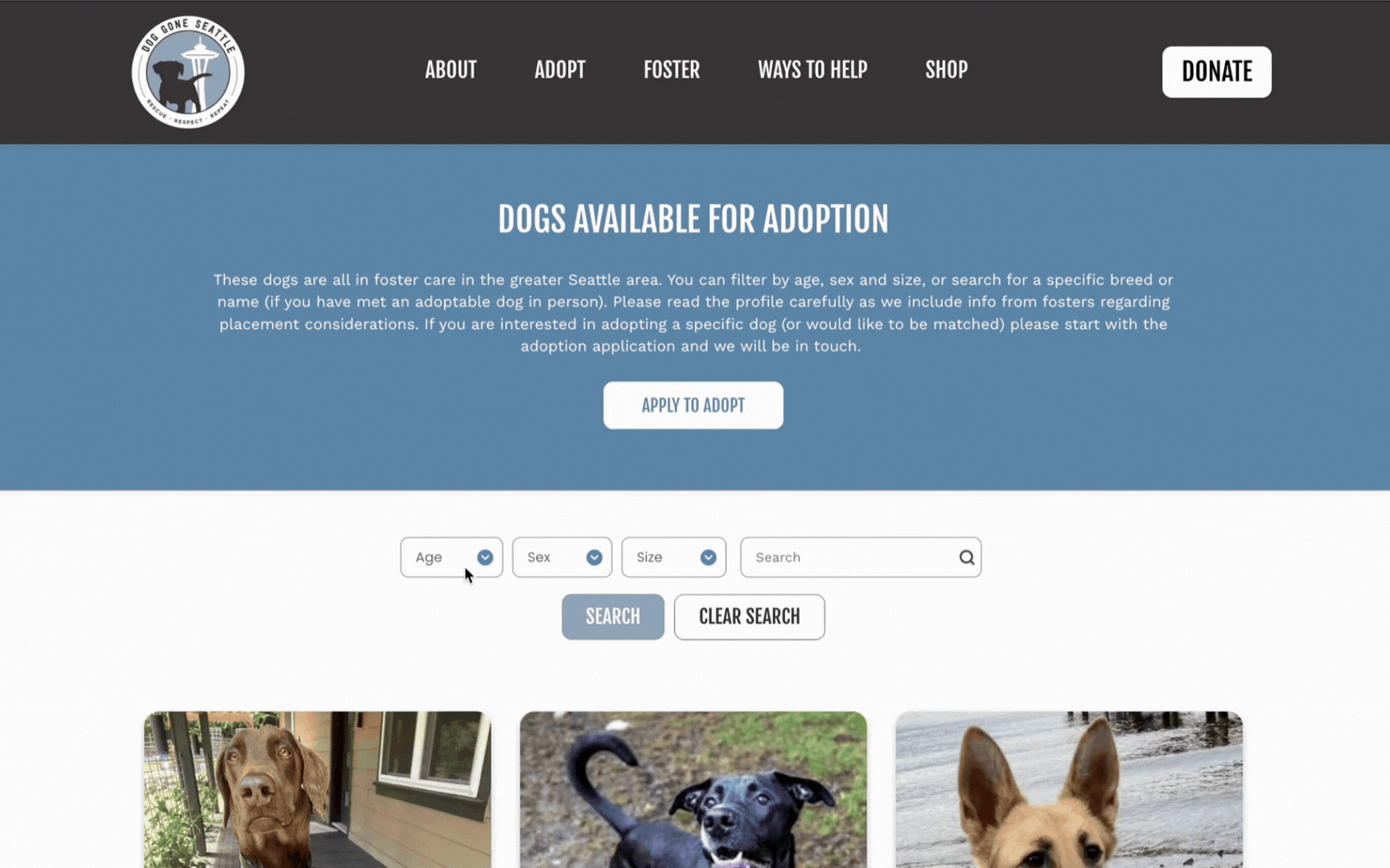
Users can now filter by size! If users select to filter for dogs that are small, medium, or large, they’ll be taken to a page for their selected dog size while still applying the other toolkit filters.
Project Takeaways
It takes a village – not only to run a dog rescue, but envision a completely redesigned site. This project wouldn’t be possible without the work of my team at my agency who shared lots of great feedback and helped execute the development of the final site!
When technology limits us, you can pivot. We originally wanted the adoptable dogs page to show dogs filtered by size but were constrained by the limitations of the rescue’s toolkit. Our solution was to pivot by taking the user to separate pages that showcased size as a simple workaround.
Balancing stakeholder needs is key to any redesign project. I learned so much about carefully considering the needs of our client, as well as those involved in the rescue, against the limitations of a redesign.